It is familiar to everyone in the design fraternity. As a web designer, you turn around and find your newly built website has a lot of design errors. As an mobile app designer, you find your app looks dull when compared with other similar apps. These reactions are quite common. But these mistakes can make a business pay dearly, so we are here to detect and provide safeguards to these common design error mistakes.
Top design errors to be aware of:
Not Using a Grid
You made a fine sketch and, without batting an eyelid, placing it into your design layout. Now, the image or the graphic just couldn’t properly fit the screen with the right proportion and depth. Well, this is why expert designers always use a grid to allow scaling.
Obviously, as a designer, you can’t just fix everything overnight. Hence, it is advisable to fix such design mistakes by using grid-based tools to scale the image or graphics as per the available space. Most important of all, evaluate the image in the overall design scheme and take a call.

Using Ready to Use Theme with No Customization
The pre-designed themes are primarily popular among web and app designers because they come with proven and time-tested layout conventions used by most websites or apps, making the design process easier. But such themes are also commonplace ones lacking typical custom attributes that make a design befitting to the niche requirements. This is why using a ready to use theme with no customization can be disastrous to your brand.
You can take a premium theme that looks near-perfect for your website design requirements. Now spend a little to access a small repository of tools that you can use to customize certain aspects of your theme. These tools will allow you to find your voice and contour through the design, from changing the colour scheme to changing the fonts.
According to Mr Juned Ghanchi, the CMO of IndianAppDevelopers, “Even the most expensive theme doesn’t help a brand if it is used without tweaks. It is your brand value that should stick out of the design instead of the design itself.”
Not Optimizing User Flow
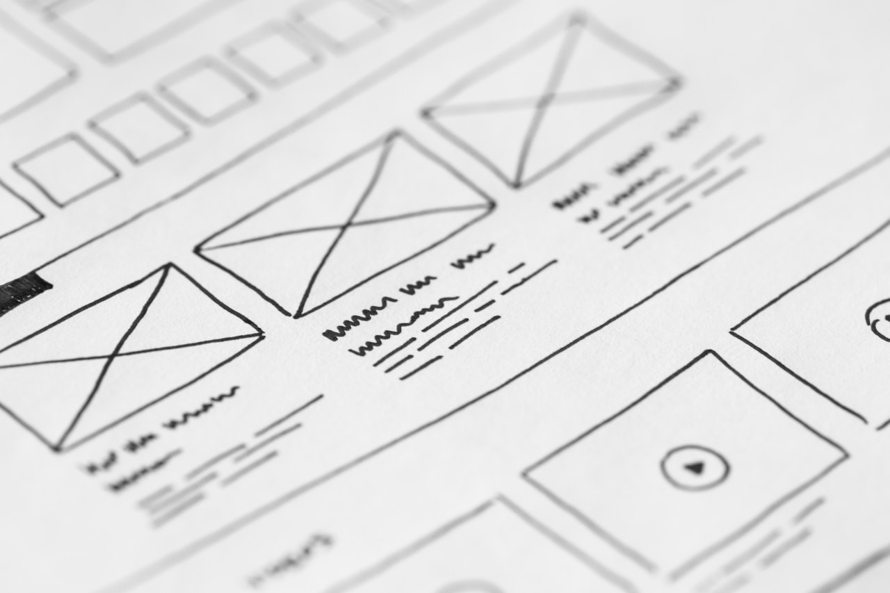
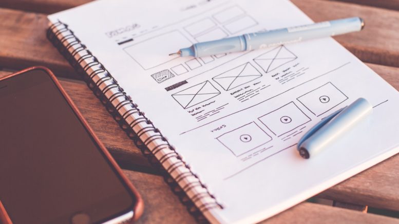
One of the key responsibilities of the UI/UX designers is to ensure optimum user flow to deliver a smooth experience. It largely depends on the app’s structure that you have to decide upon during the wireframing stage. You can only optimize the user flow by reducing the steps required for completing an action. More effortlessly and fast, a user can carry out a task; it can boast a better app workflow.
Imitating Similar Apps
If you think what Uber did with its user interface is just perfect and you can make a great app by simply imitating it for your new cab booking app, you are completely wrong. What Uber did is delivering a truly unique user experience with a simple and engaging design. A new app can only look like a cheap clone while sacrificing the unique brand value altogether by imitating it.
You can take inspiration from successful apps and use certain UX attributes and features partially for your app. But you cannot ultimately make a copy of it and expect to be successful.
Ignoring Thumb Rule
Most of the smartphone users these days make use of their thumbs to navigate the app screen single-handedly. This is why the app designers need to place important buttons, clickable items, and interactive elements closer to the thumb access zone. This principle, over time, has become the Thumb Rule of interface design now.
Since 67% of smartphone users use the right-hand thumb for scrolling and navigating and since there are only a negligible number of left-handed users, you need to create the thumb zone keeping mostly the right-handed users in mind while targeting left-handed users partially.
Difficult Tap Targets
The mobile screen’s tap targets are all the clickable elements and buttons that allow interactions with the device and the app. If these tap targets are difficult for the fingertips to tap on or appear less visible, there will be fewer interactions because of this design fault. It is needless to say that fewer interactions always lead to fewer business conversions and this common design errors is one that should be avoided.
If the tap targets are too small that the users are likely to miss or are often less responsive, it can only aggravate the users’ frustration and undermine the user experience. On the other hand, the tap targets must appear to be easily visible with the right contrast against the background. Lastly, the buttons and tap targets should be appropriately coloured, maintaining colour psychology. A cold blue button cannot ruin the salivating warmth of a buy button in a food app.
Conclusion
Design errors across digital platforms are numerous. There are too many of them. But you need to find the key mistakes and orient the errors about the user experience. Then you know how to fine-tune the design by addressing tiny mistakes here and there. Since app and web design play a decisive role in creating a brand presence and rolling the wheel of sales, every design mistake needs to be addressed at the earliest.

Be the first to comment on "6 Website Design Errors – How to Avoid & Fix Them Simultaneously?"